
How Resell Ready Video Courses Make Money
Resell ready video courses give creators and marketers a faster way to launch, sell, and scale digital offers without building from scratch.
A template kit can save you days of design work, but only if you know where to make smart changes and where to leave the structure alone. If you are figuring out how to customize WordPress template kits, the goal is not to reinvent every page. The goal is to turn a ready-made layout into a site that looks branded, works cleanly, and helps you launch faster.
That matters if you are building client sites, affiliate projects, local business pages, lead-gen funnels, or a fast-turnaround digital brand. A template kit gives you a huge head start, but the real value shows up when the finished site stops looking like a demo and starts looking like your business.
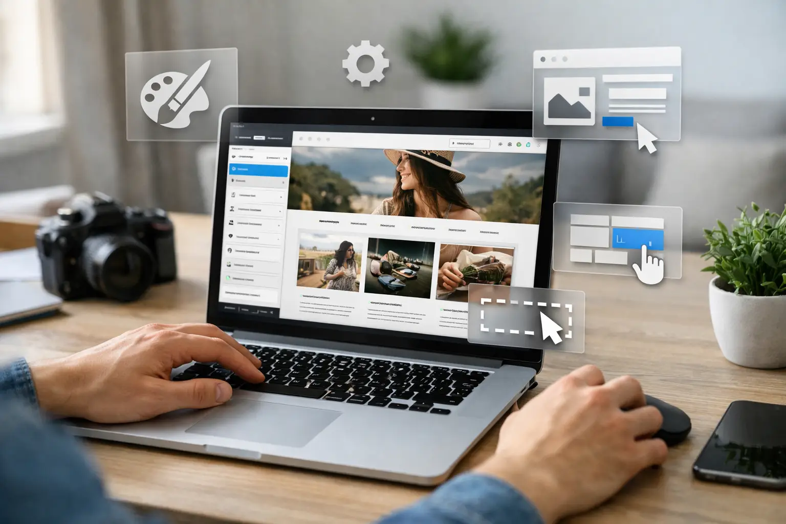
Most WordPress template kits are collections of pre-designed page layouts, headers, footers, popups, archive templates, and sometimes block or section designs built for a page builder. In many cases, that means Elementor, but some kits are built for other builders or block-based workflows.
A kit is not usually a full theme in the old-school sense. It is more like a shortcut system. You import the layouts, assign the parts you want, replace the placeholder content, and shape the design around your brand.
That distinction matters because customization happens in layers. You are not just changing text on a homepage. You may be adjusting global fonts, swapping color palettes, rebuilding calls to action, changing section spacing, replacing icons, and deciding which templates should apply to blog posts, services, or landing pages.
The fastest way to waste a good kit is to start editing random sections before setting your foundation. You will save time and get a better result if you customize in the right order.
Before you touch page content, set your global design rules. That means your colors, typography, logo, button style, and default spacing. Most page builders let you define global fonts and site-wide colors, and this should be your first stop.
Why? Because one change at the global level can update dozens of sections instantly. If you skip that and start editing page by page, you create extra work and inconsistent design.
If you are building for a coaching brand, a fitness offer, or a digital product storefront, your typography and colors do a lot of selling before anyone reads a single sentence. A premium-looking font pairing with a clean, limited palette often performs better than overdesigned pages with too many visual styles.
A lot of users make one of two mistakes. They either keep the kit too close to the original and end up with a generic site, or they replace so much that they destroy the speed advantage.
A better approach is to audit each section and ask a simple question: does this layout already support the message and goal of the page? If yes, keep the structure and rewrite the content. If not, replace only that section.
For example, a three-column feature block may work perfectly for a software offer, a service business, or a course page. You do not need to redesign it just to make it feel custom. But if the hero section is built around a fashion brand aesthetic and you are selling B2B marketing services, forcing it to fit will cost more time than swapping it out.
Good customization is not just visual. The copy has to match the audience, offer, and conversion goal. Demo text is there to show layout, not to sell your product.
Update headlines, subheads, button text, benefit sections, trust signals, and FAQs early. Once the copy is in place, you can see what sections still fit and what spacing needs to change.
This is especially important for entrepreneurs working with bundled assets or done-for-you website components. Speed matters, but conversions matter more. A clean design with sharp copy will usually outperform a flashy design with vague messaging.
Stock images are often the biggest giveaway that a site came from a template kit. Replace them early. Use real brand visuals, product mockups, screenshots, lifestyle images that fit your market, or simple graphic sections that support the message.
Icons deserve attention too. If the kit uses mixed icon styles or icons that do not match your niche, swap them for a consistent set. Small fixes like this make a site feel more premium.
The trade-off is file size. High-resolution visuals can make a site look polished, but oversized images can also slow it down. Compress what you upload, use the right dimensions, and avoid loading giant graphics just to fill space.
This is where many beginners get blindsided. A kit can look great in the editor and still perform badly on the live site if you overload it with fonts, animations, plugins, and heavy images.
Template kits often include extra pages, blocks, effects, and widgets that are useful in the demo but unnecessary on your finished site. Delete anything you are not using. Unused sections, duplicate templates, and extra popups only create clutter.
If a page has five animation effects and only one actually helps direct attention, keep the one that matters. Motion can improve the feel of a site, but too much of it makes pages feel cheap and slower.
A template kit may require a specific builder and a few supporting plugins. That is normal. What hurts performance is stacking plugin after plugin to solve tiny design issues that could be handled another way.
If you need a form plugin, SEO plugin, caching plugin, and security plugin, that is one thing. If you are adding three extra plugins for sliders, icon packs, and decorative effects, you are probably paying for that convenience with speed and maintenance headaches.
Most template kits claim responsive design, but responsive does not always mean polished. Check every important page on mobile and tablet views. Headlines may wrap badly, buttons may sit too close together, and spacing may feel awkward after you swap content.
Mobile customization is not optional. For many businesses, it is the primary experience. If your site sells digital products, books calls, or captures leads, the mobile version has to feel deliberate, not auto-generated.
One major mistake is changing too many colors. Another is using too many font styles to force personality into the design. Strong branding usually comes from consistency, not excess.
Another issue is ignoring the template hierarchy. If your kit includes a single post template, archive template, and header-footer system, make sure those are assigned correctly. Otherwise, parts of the site may look customized while blog posts or category pages still show unfinished defaults.
There is also the temptation to judge a site too early. Template kits often look awkward during the middle stage because placeholder elements are half-replaced. Do not panic and scrap the whole design before the copy, images, and global settings are fully updated.
Template kits are ideal when speed, budget, and launch momentum matter. They are a strong fit for service businesses, affiliate sites, online course funnels, creator brands, local business websites, and early-stage ecommerce support pages.
They are less ideal when the project needs highly custom functionality, unusual user flows, or a very distinctive design system that cannot be achieved without heavy rebuilding. At that point, a custom build may be the smarter investment.
That does not make template kits a compromise. It makes them a tool. For many entrepreneurs, a well-customized kit gets you to market faster, keeps costs under control, and creates more room to spend on traffic, content, or offers.
Treat the kit like leverage, not a limitation. You are buying speed, structure, and starting momentum. The win is not proving you can design every section from scratch. The win is launching a site that looks credible, supports your offer, and helps you move faster than competitors still stuck on blank pages.
If you sell digital products, build client sites, or stack ready-to-use assets into offers, this approach fits the bigger business model. You do not need more complexity. You need assets that shorten the path from idea to income. That is exactly why platforms like Create it Digital appeal to builders who want more output without sourcing everything one piece at a time.
The best customized site is not the one with the most edits. It is the one that looks intentional, feels easy to use, and gets published while the opportunity is still hot.
Resell ready video courses give creators and marketers a faster way to launch, sell, and scale digital offers without building from scratch.

Learn how to customize PLR ebooks fast so they look original, match your brand, and sell better across niches, funnels, and digital offers.

Learn what master resell rights mean, how they work, what you can legally sell, and where the real profit potential and limits actually are.

Discover the best AI resources for entrepreneurs to save time, create faster, market smarter, and build scalable online income with less overhead.